Fifth Third Bank Private Banking Site Refresh
Fifth Third Bank’s Wealth management division was in need of a site overhaul. As CCO, I oversaw our interactive team and creative teams and led this project’s design, UI/UX, creative and copy implementation. Credits: Nick Ress.
Overhauling an outdated interface
When my team and I started this project, Fifth Third had just implemented a new brand guide for their wealth management division. It was my responsibility to ensure we brought their new brand into the interactive space seamlessly and effectively while recommending any adjustments through the creation of our UI guide.
From a UX standpoint, their current experience was clunky. At a high level, their wealth management site felt silo-ed, was difficult to navigate, the home page did not facilitate quick discovery and search-ability for the users’ needs, their content was not SEO-friendly, and the flow of the pages did not push users further into their sales funnel. In addition, our research showed that only 15% of traffic was coming through on mobile.
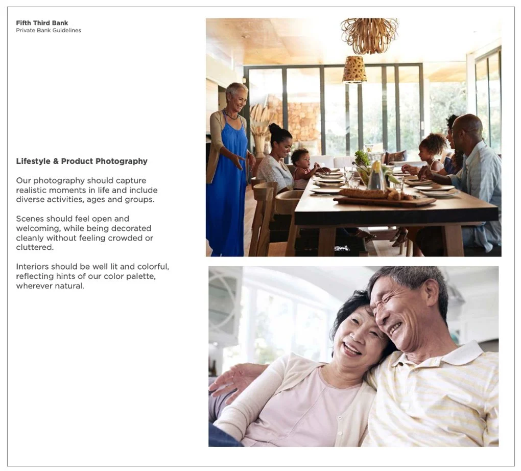
From a UI standpoint, we sought to make the experience feel more premium like you’d expect from such a large wealth management firm. We also needed to implement the new brand guide and recommend tweaks based on our UI guide recos.

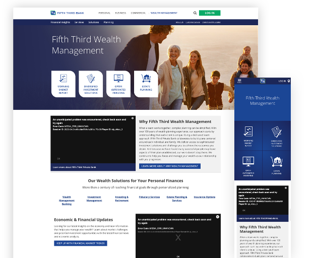
Before The Refresh
Checkout this snapshot of where the site was before my team and I implemented our new approach.
Crafting A New User Experience
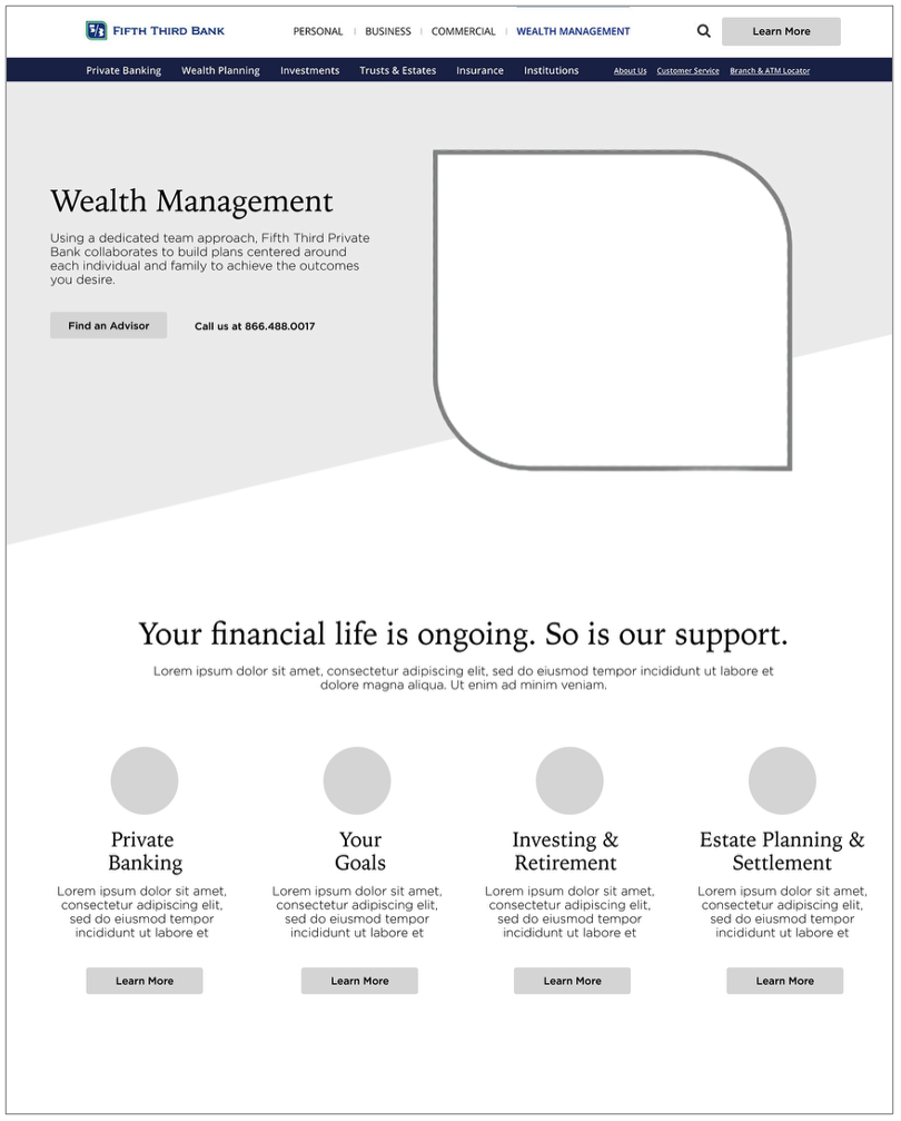
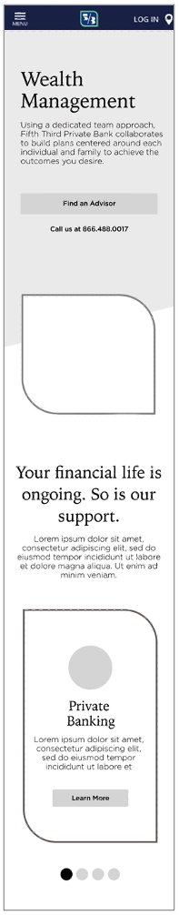
While this is just a snippet of the wires, we started by simplifying the flow of the page. We added additional subnav so users could more quickly identify their needs. We reduced complexity in the header to provide a simpler clearer introduction so users would know where they were, and what to expect.
From there, we simplified the information on the page by using iconography and scannable text to allow users to quickly navigate deeper into the site to meet their needs.
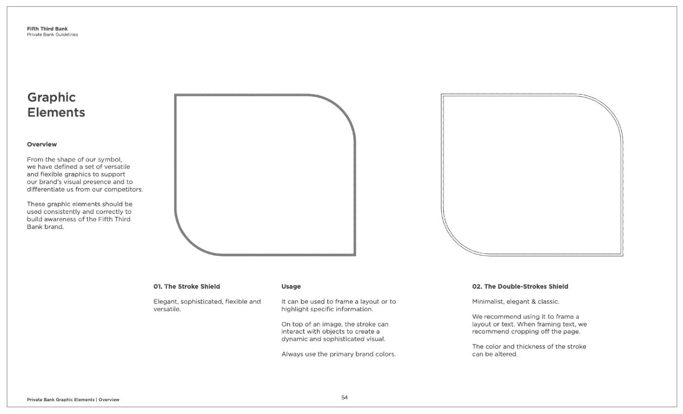
In addition, we set the stage for correct brand guide usage of their enhanced brand shape.
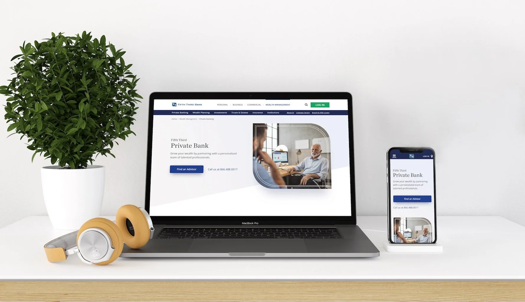
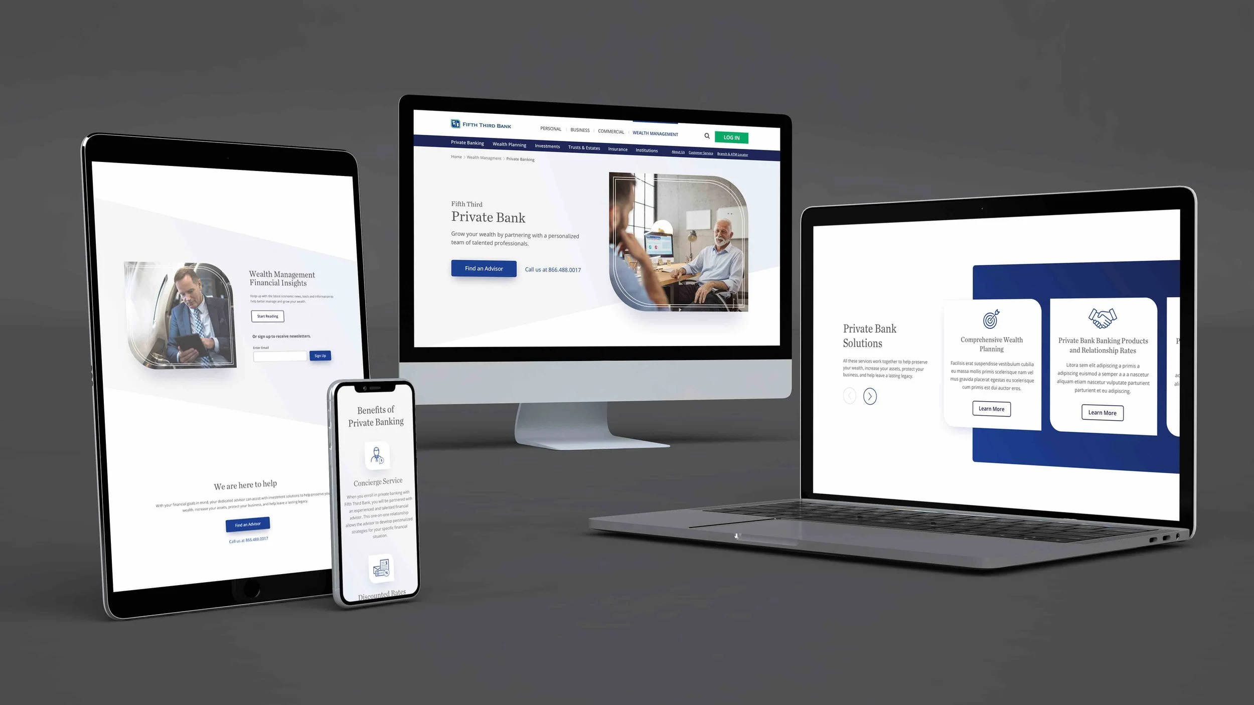
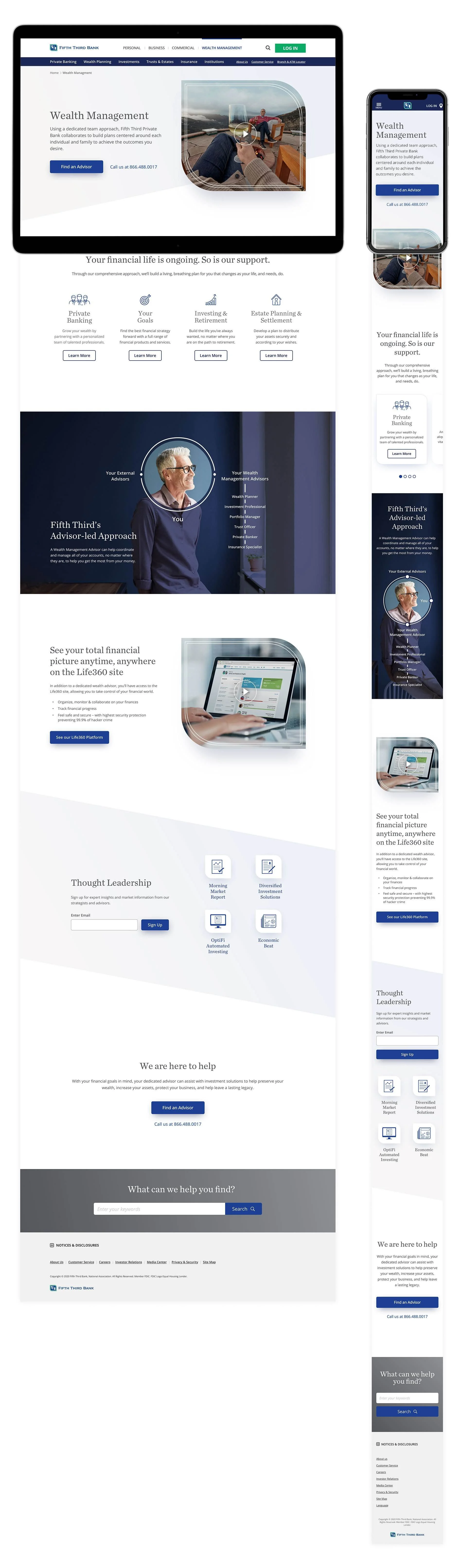
Refreshing The UI
After completely redoing the UX and content flow. We brought in the new brand look and feel, made the site more mobile-friendly, and elevated the overall design to align to the level of clientele and personas we were targeting. Scroll down to see a full page in desktop and mobile.