Refreshing Burn Media Co.’s Web Presence
Burn Media’ Co’s website needed an overhaul. From a confusing interface and a weak UI guide, to an overall lack of a cohesive story and clunky UX, we needed to improve every aspect of Burn Media Co’s web presence.
Before The Refresh
Checkout these snapshots of where the site was before my team and I implemented our new approach.


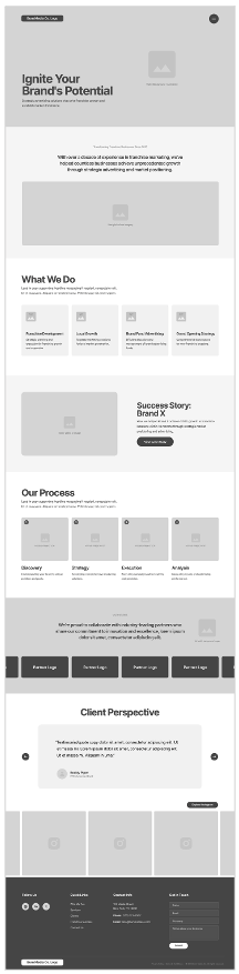
Crafting A Better User Experience
We started by blowing up their site and creating a new narrative with a more thoughtful content flow and a simpler UX path for the user. Their current story did not clearly articulate what Burn Media Co. was all about in a quick and compelling way. In addition, the flow of each page was not user-friendly and made it difficult to find the right info and contact their company. Here are a few of the wireframes from the process.


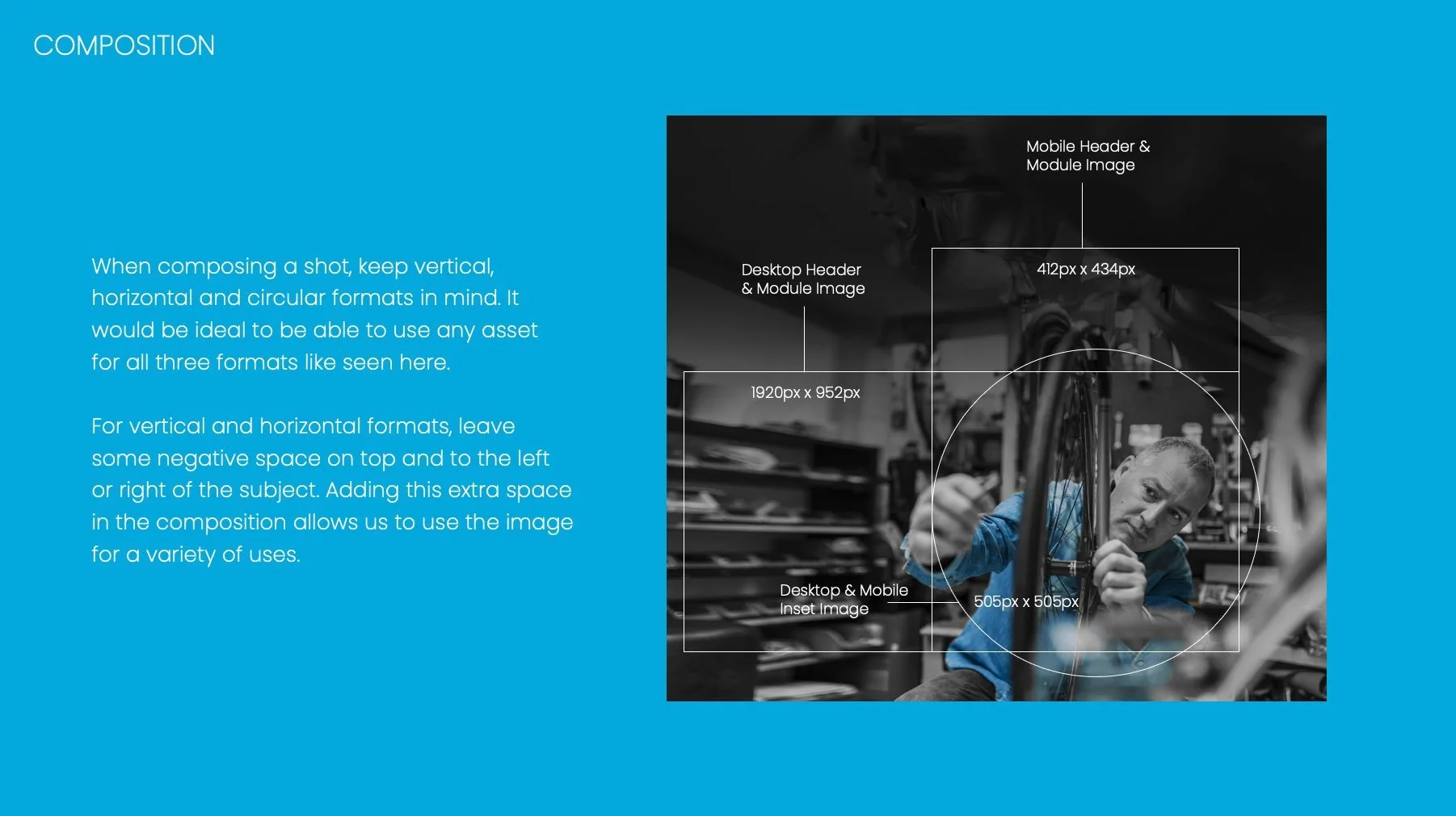
Refreshing The UI Guide
Burn Media Co.’s brand and UI guide was in need of refinement. They had relied on an illustration style to communicate the majority of their design. And their color scheme overall was very dark. We updated the guide with a fresh approach to their color scheme and a more ownable treatment for their photography along with a photo guide for a new shoot. The overhaul made their site more professional, more branded, and more modern.