Creating A Digital Transformation For A National Gym Franchise
Burn Boot Camp was in need of a digital overhaul. They had built up a large network of over 400 franchises in the US, but their site lacked an intuitive user experience, strategic alignment to their overall brand objectives, unbranded design and content, and an outdated framework. I helped lead the digital transformation from start to finish, helping lead workshops, strategic frameworks, wire-framing, UX/UI, writing, and QA.
Overhauling an outdated interface
When my team and I started this project, Burn Boot Camp had undergone a period of substantial growth, but their website presence was in severe need of updating.
From a UX standpoint, their was not a clear journey for any of their targets. The brand’s desire to sell nutritional products, pitch their founders’ books, and a quest to sell franchises made their site feel muddled. In addition, our research showed a high bounce rate and customer heat-mapping that proved customers were often confused, and not able to find the content they needed.
In addition, an entire overhaul of the site’s structure and navigation was required to tell the story in a way that prioritized the different segments of their audiences.
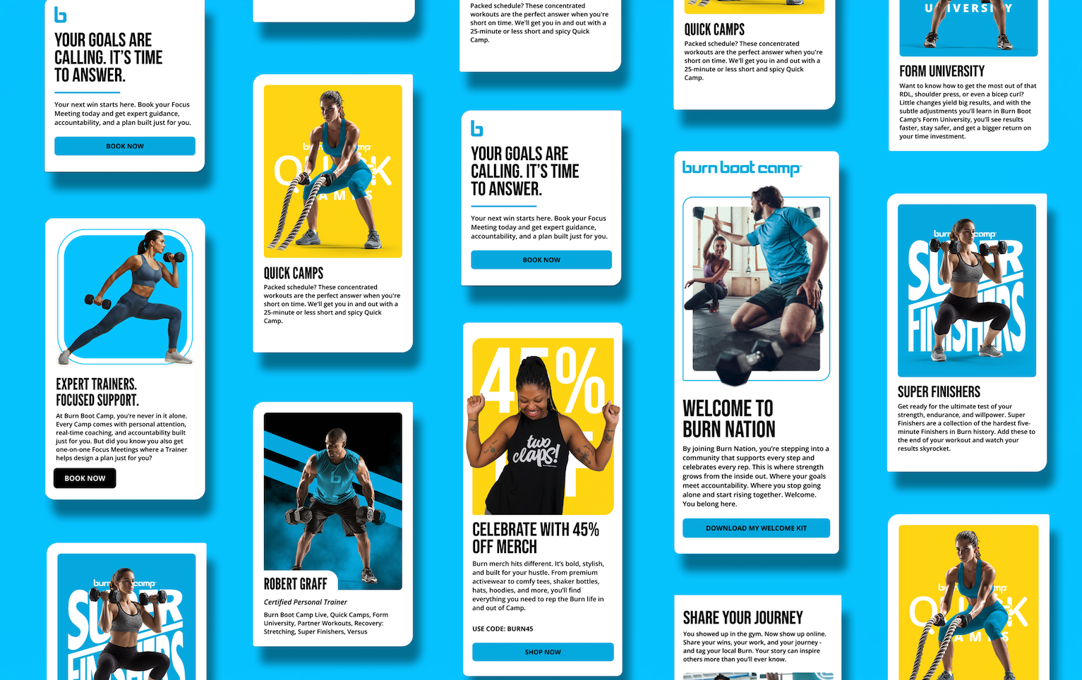
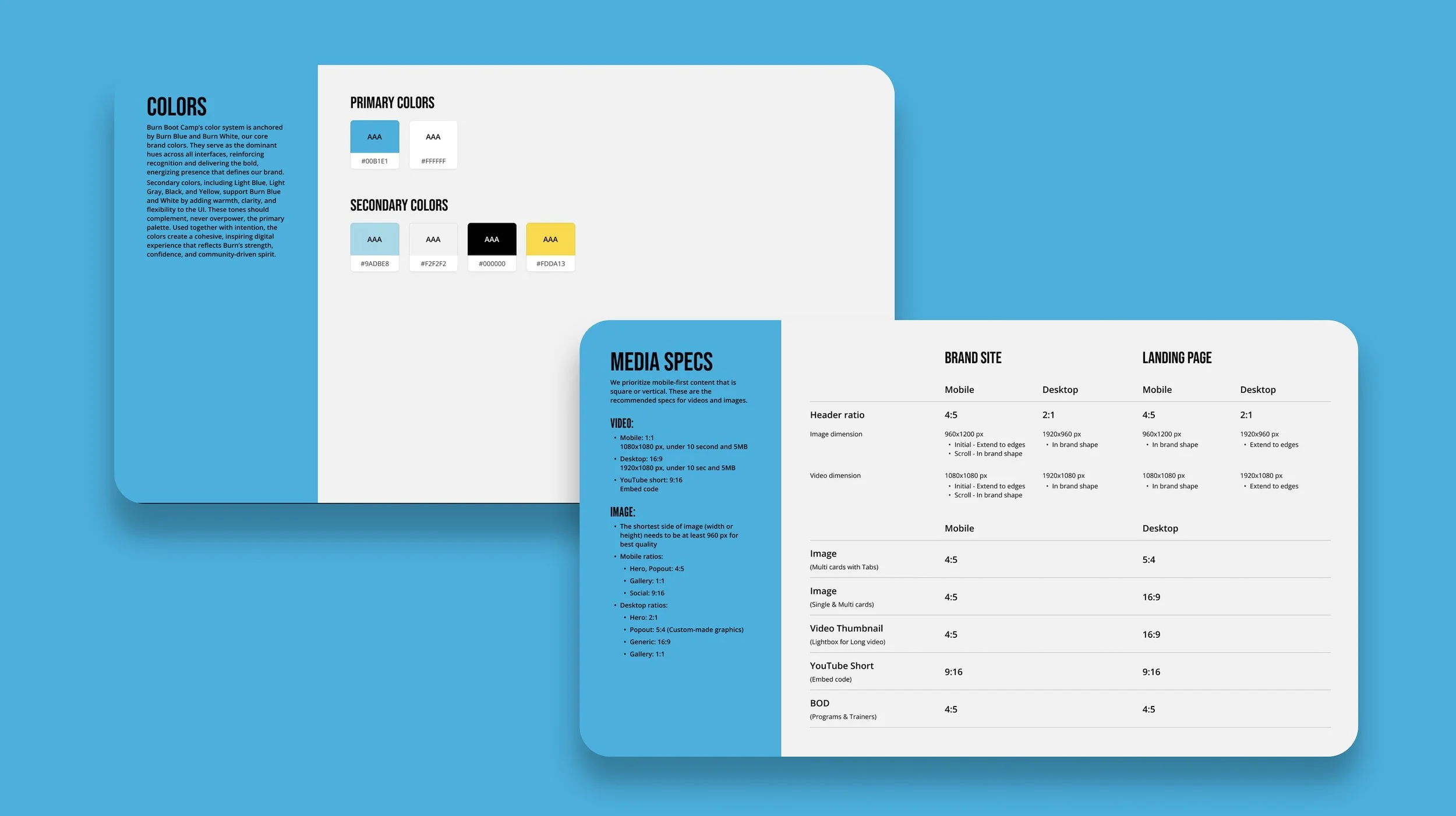
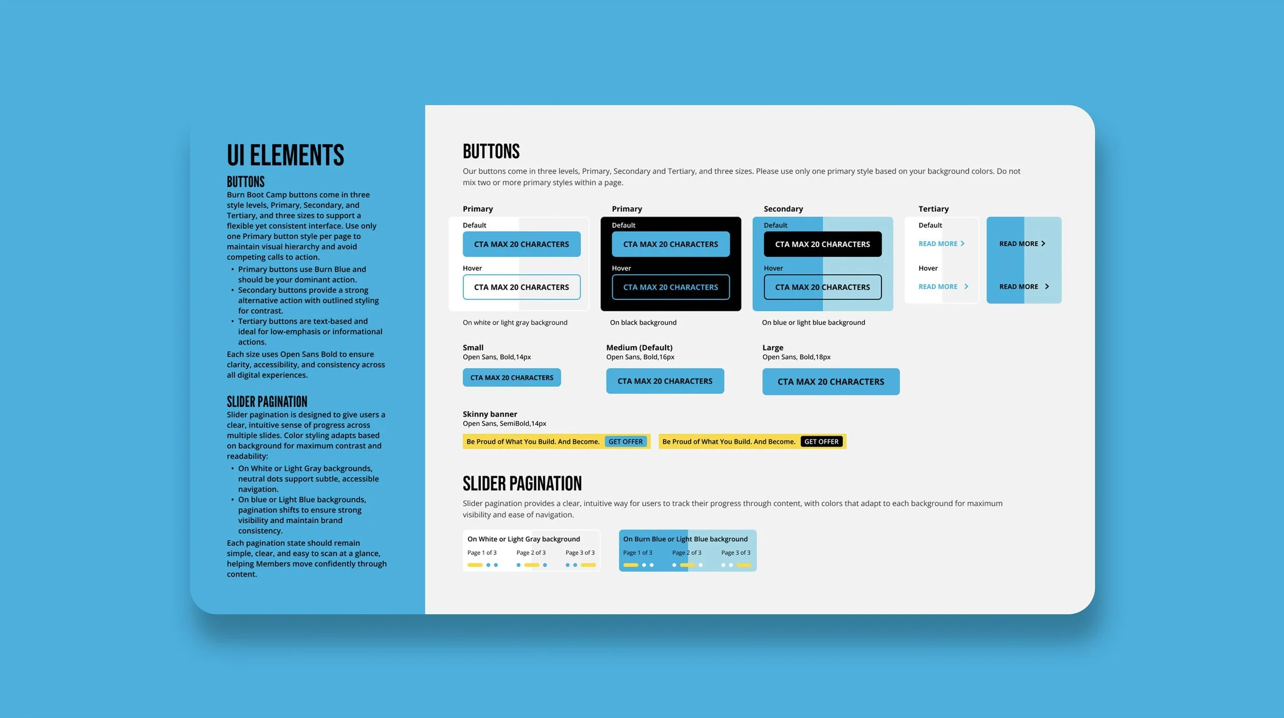
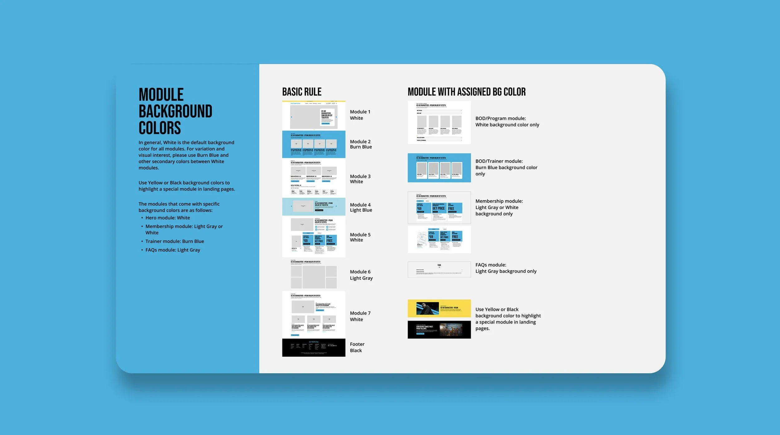
From a UI standpoint, we started by creating an entirely new UI guide featuring new standards, a fresh look and feel, a new treatment of their color system, a new web font, and a component-based design system that would allow easy page-building with a transferrable look and feel for their email work as well.
Before The Refresh
Checkout this snapshot of where the site was before my team and I implemented our new approach.
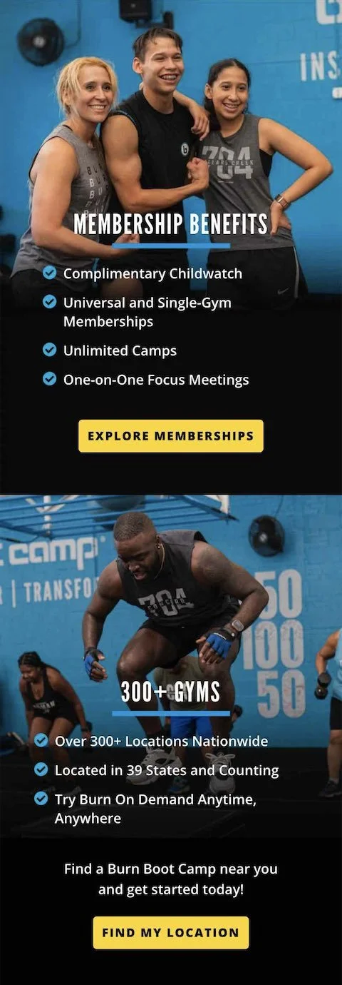
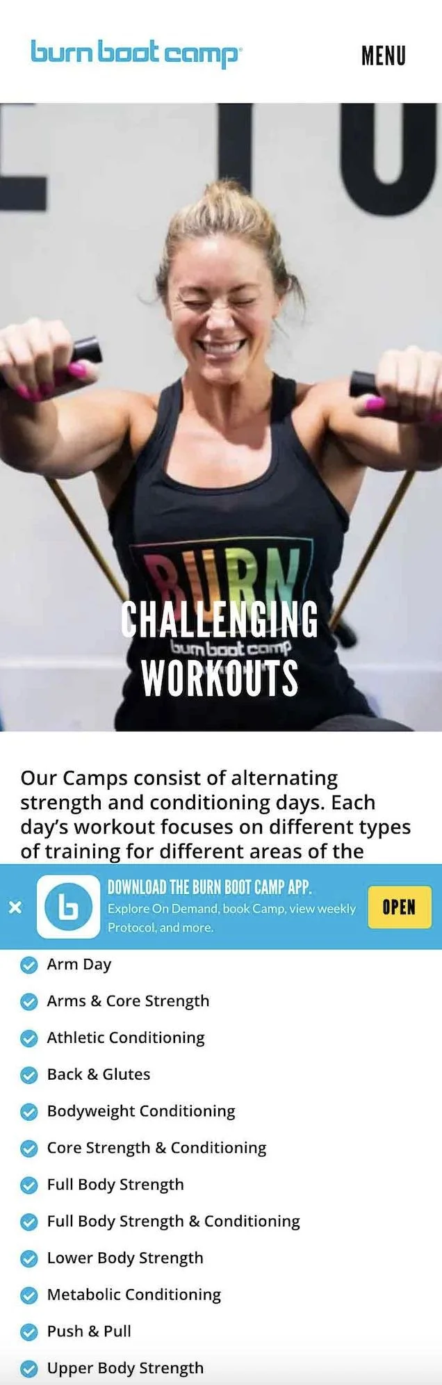
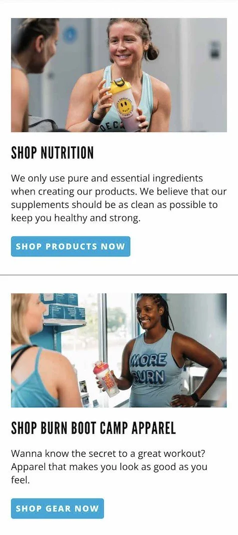
Crafting A New User Experience
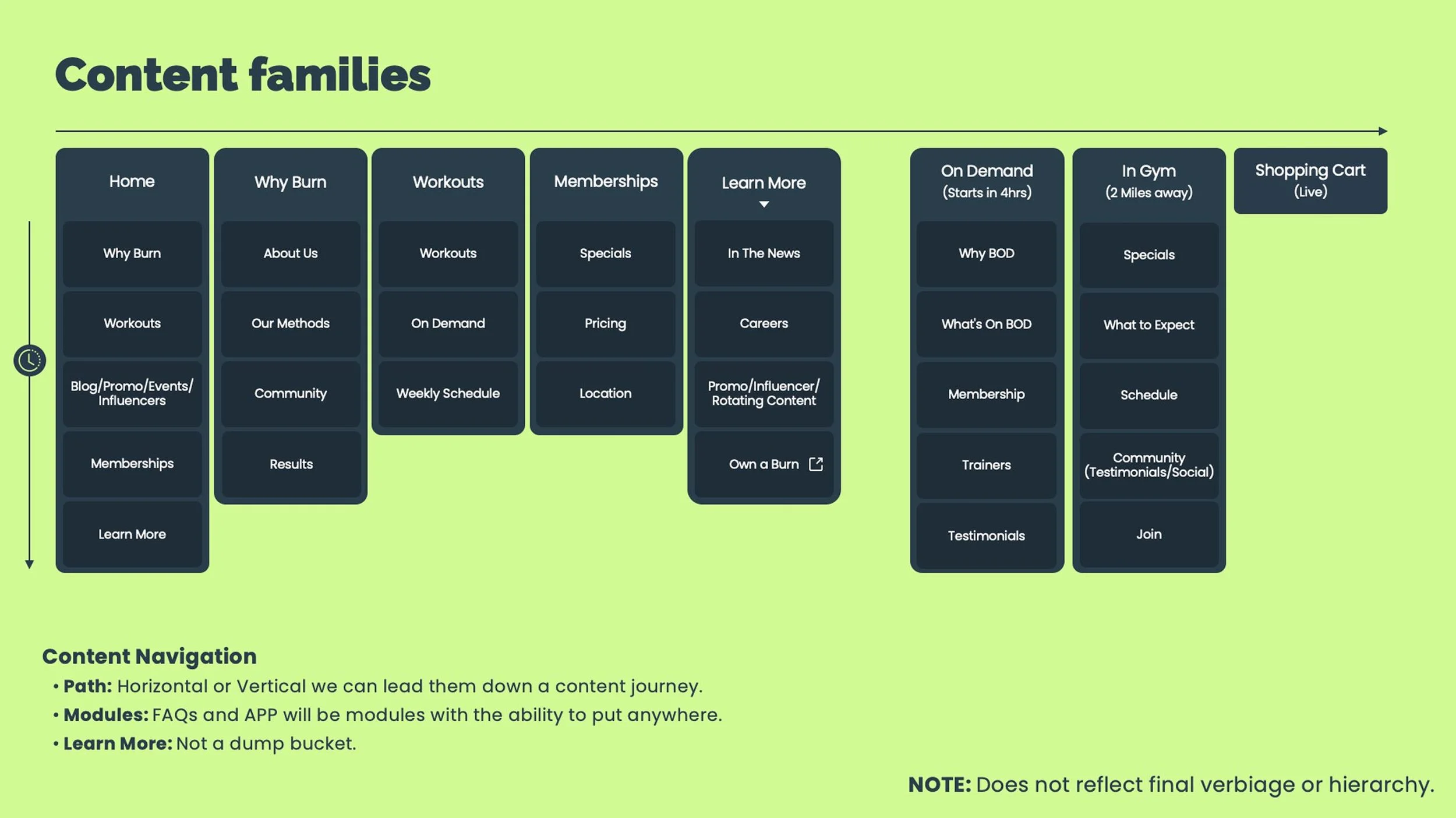
The redesign started with a closer look at the site structure and navigation. In general, the existing site was unorganized. Each page had combined all audiences, making it difficult for users to understand the desired action, and which information applied to them.
The site was restructured to lead with the core user, gym-goers, and what makes Burn different as ell as what to expect. We also made sure to include a dynamic module that would deliver a promo based on their nearest location.
We also separated out two main objectives for Burn, selling virtual workouts and in-gym workouts. We did this by creating dedicated pages for those specific use cases. And where Selling franchises was once mixed into most pages in an awkward way, we created a specific space for anyone interested in owning a franchise.
Check out the updated site map and wires below.






Creating A New UI Guide
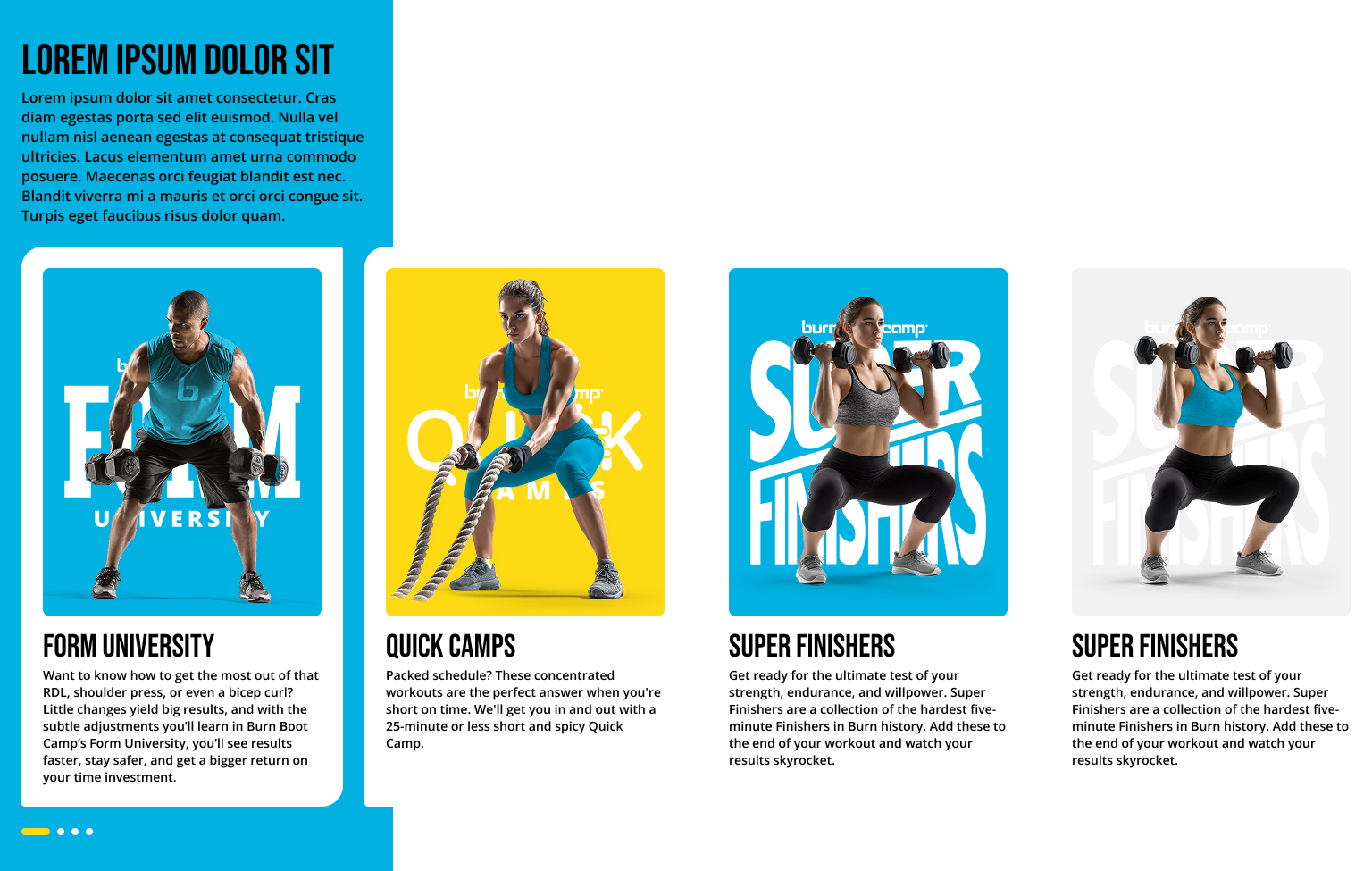
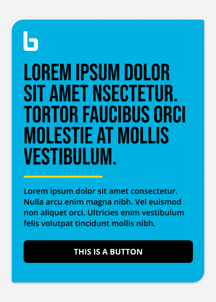
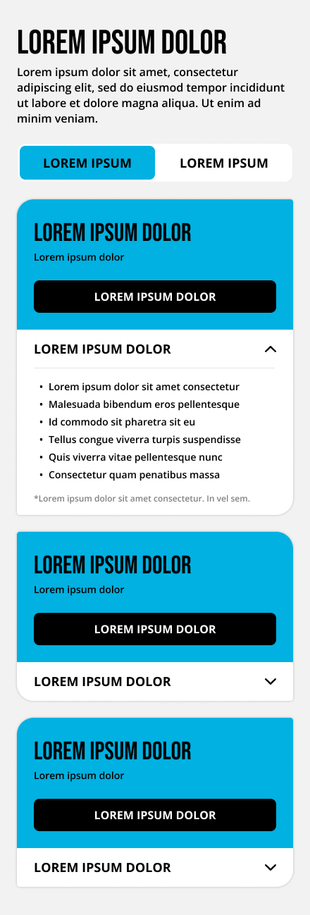
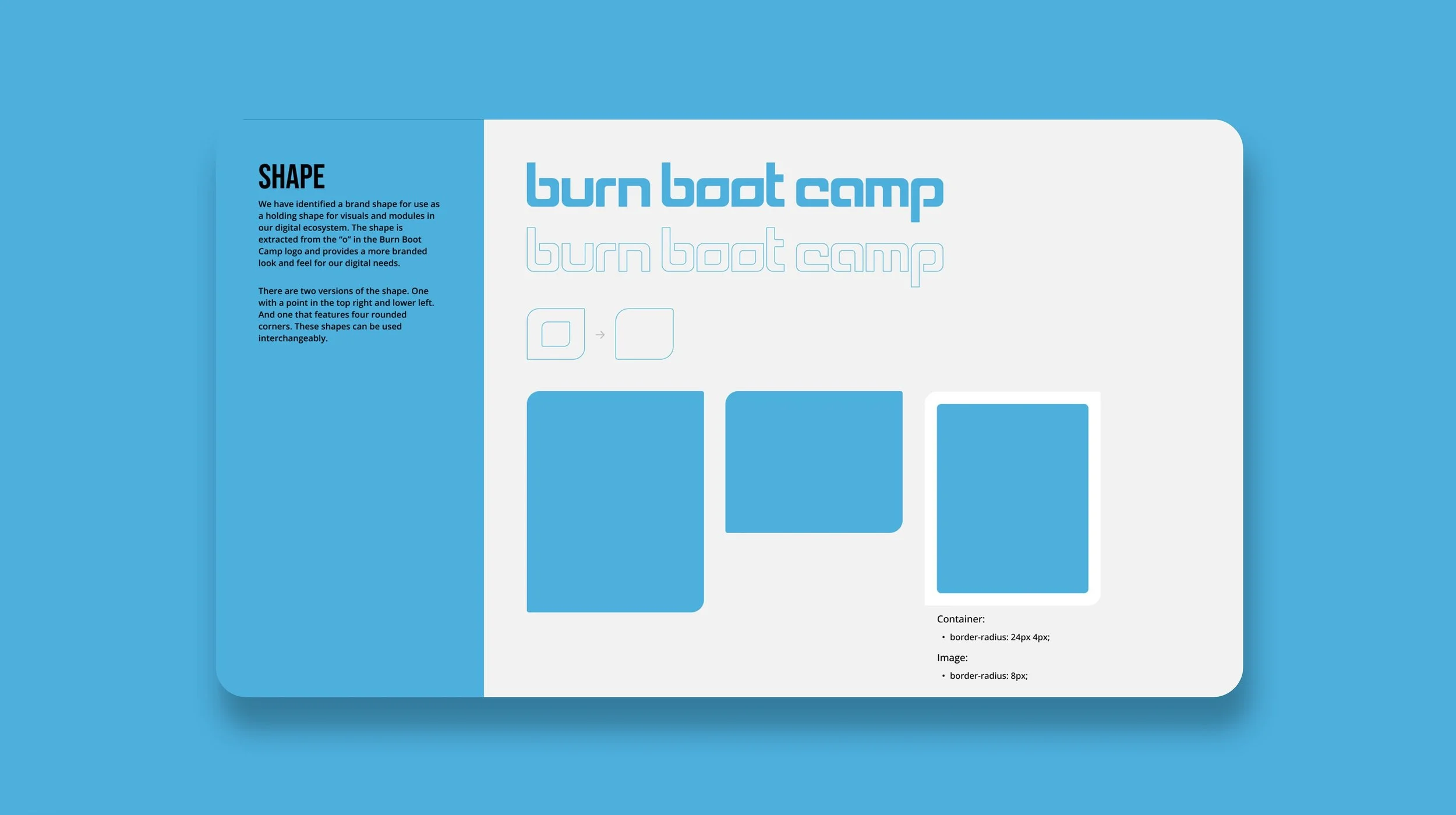
As part of the refresh, I led the creation of a new look and feel, a component-based design and development approach, and a new foundation of UI guidelines to help ensure the site would be accessible, governed, responsive, and modern. I even designed a new brand shape based on the shape of the logo type to help add a greater sense of design and brand ownership to the work. The new shape swapped the hard, boxy feel of their current site, with a more rounded group of holding shapes that aligned better to the existing design language. Check out a few pieces of the UI guide.
Making a Component System
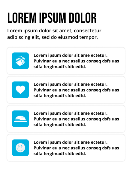
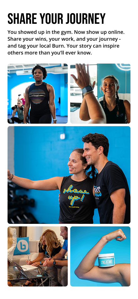
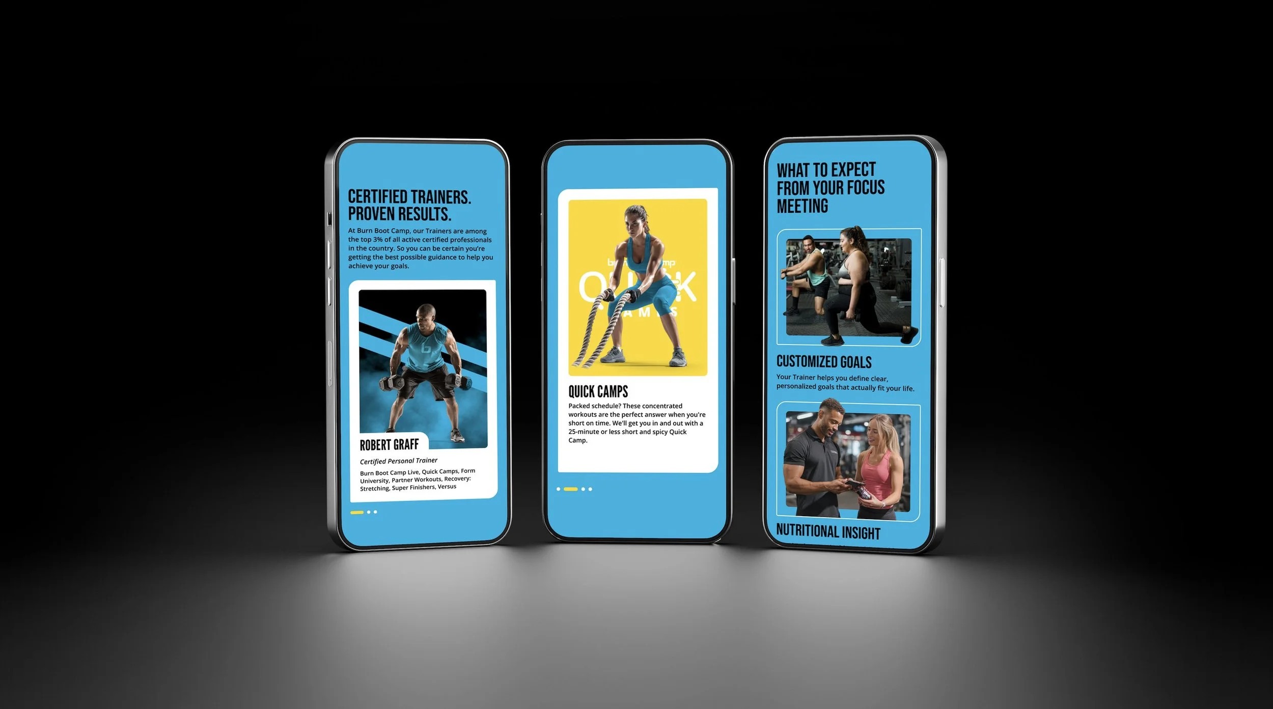
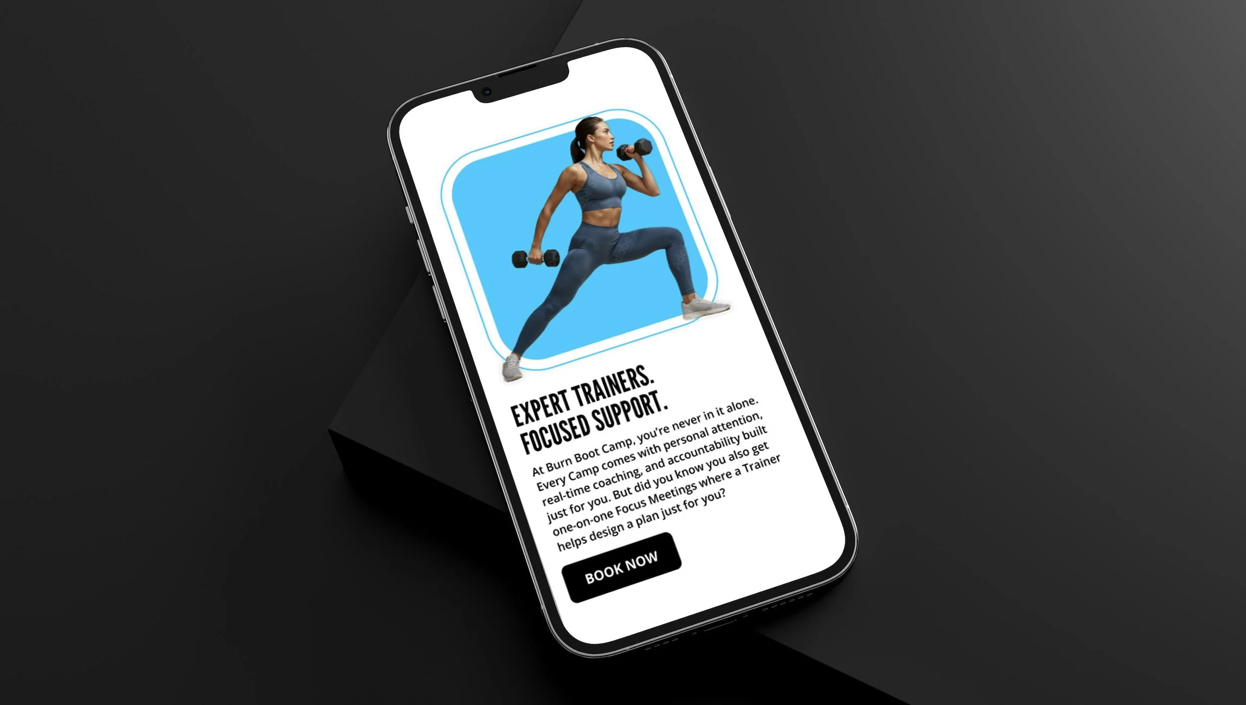
I introduced a new component system featuring fresh new designs, color usage, and a more energetic use of gym-goers and Burn trainers. The components featured the new brand shape I created as well. In addition, the components were reusable and designed for a variety of purposes so they could be dragged and dropped into the back end to make creating new pages a snap. Check out some of the modules and components, then a few looks at the final site.