Refreshing A Global Brand’s Website
LG Business Solutions had been struggling. Their sales were down, and their competitors were rapidly eating into their marketshare. In short, their B2B brand needed an overhaul. And fast. Here’s how I approached the web portion of this larger brand refresh project.
Where They Were
The current LG Business Solutions site had numerous issues from a UX and UI standpoint. They relied on outdated carousels of 6 or 7 rotations to push product mix. The site map and navigation structure of the site was confusing. The home page did not provide users with organized or relevant content that clearly explained things like LG’s objectives, their products, how to learn more, connect with sales people, and the list goes on.
From a design perspective, the overall look and feel of the site did not align with who they really are - an innovative technology company that was selling some of the most advanced solutions in the world. So our designs needed to solve for this by making them look more tech-forward, sleek, and modern to align with their desired global positioning. In addition, the current site was not leveraging the LG brand guide, so there was a disconnect between the global look and feel and what they had been doing.

What We Did
We started by reimagining their site structure and navigation. The challenge was - How do you share their vast range of projects in a quick, user-friendly way? We developed a simple iconography system that could be accessed in the top nav so a user could quickly navigate to the product most relevant to them if so desired.
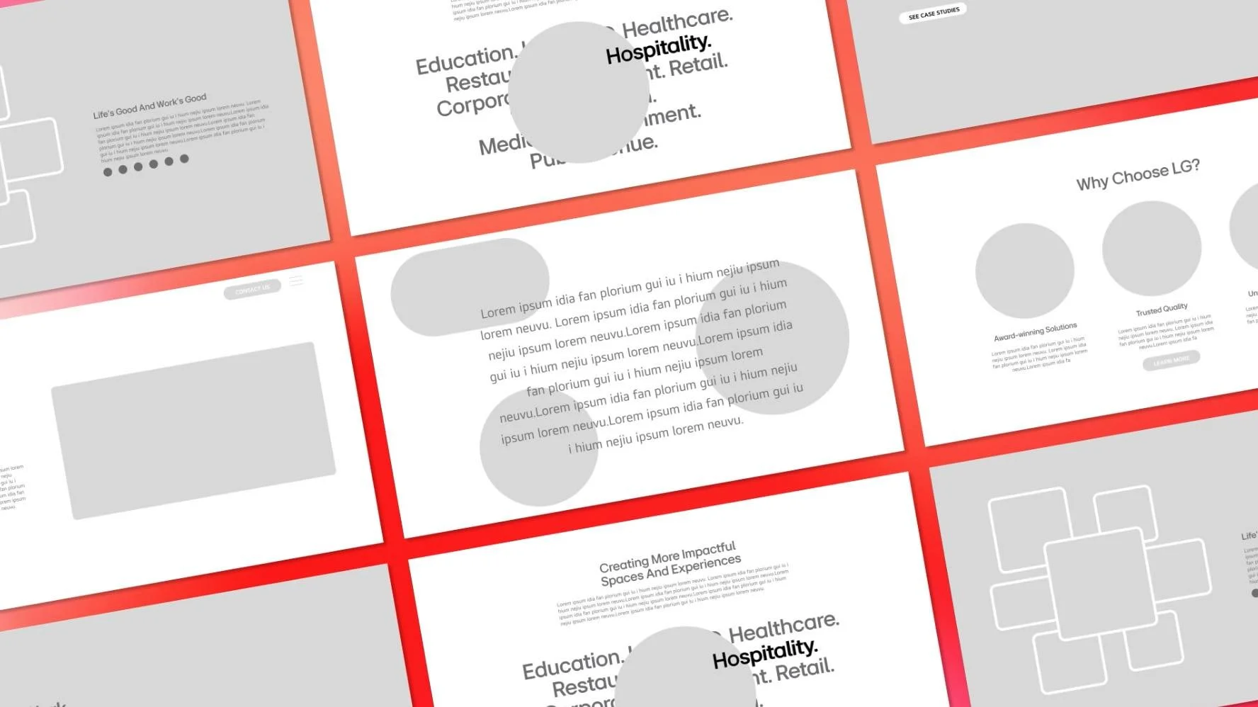
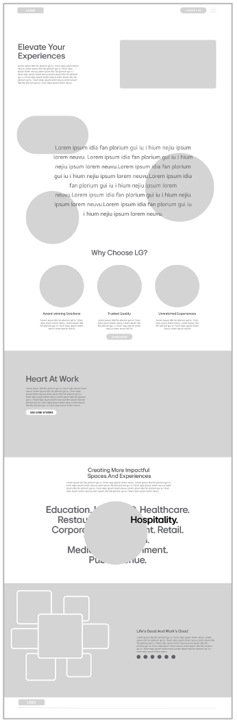
From there, we helped tell users “Why LG?” We rewrote the LG Business Solutions story to help users get a clearer picture of what sets them apart, while reconfiguring the flow of content to more clearly showcase their point of difference, their brightest success stories, and provide additional ways to quickly allow users to understand the depth and breadth of their offerings. See a snap shot of the home page wireframe frame below and how that translated to the new design.
Redesigning With Purpose
I crafted a new creative platform to better tell the “Why LG?” story that we called “Elevate Your Experiences.” As part of that campaign, we created a new way to show off multiple products in a visually engaging way. These new product showcase “collages” became part of our new storytelling device to better show the most important and relevant products to our audiences.
In addition, we incorporated the new LG brand guide in a more modern and purposeful way to ground the work in the global brand guide. I also wanted to add more dev techniques that would enhance the design while making it feel more modern and tech-forward. My solution was to add in several new techniques, like scroll locking one section to have the user control the imagery that would slide beneath the copy. I also recommended changing the direction of the scroll for the case study section to keep the user engaged while showcaing more modern development techniques.
We also faced another design challenge. How do you communicate their deep vertical depth across 10+ verticals in an engaging way? Instead of creating a long bulleted list of verticals or a grid of numerous images and copy points, we created a unique interface that allowed users to rollover or tap the vertical name and display an image to signal they types of products we sold. Users could then tap or click and go directly to that vertical page for more info.