Burn Boot Camp A B Page Test
Burn Boot Camp’s On Demand product page was struggling. Conversion were down. Bounce rates were up. And users simply weren’t finding what they needed to convert. Working with my team, I took the heat map data from the current page and made new UX recommendations to change the content and flow of the page with the goal of increasing the conversion rate.
Evaluating The Existing Page
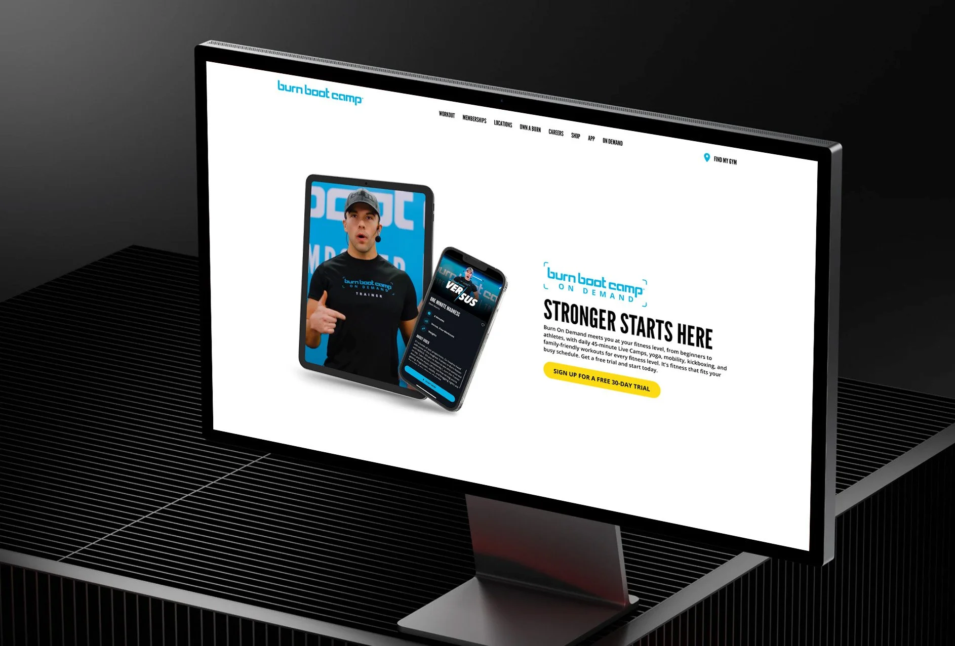
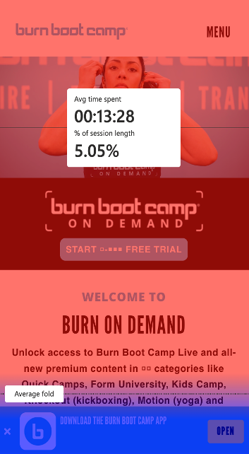
Check out the original page here. Through a thorough UX analysis, it was clearly lacking in crucial information and was not organized in a way to encourage conversion. The video content at the top of the page simply showed people working out, and gave no context as to the value of the product offering - the ability to utilize Burn Boot Camp’s workouts from anywhere.
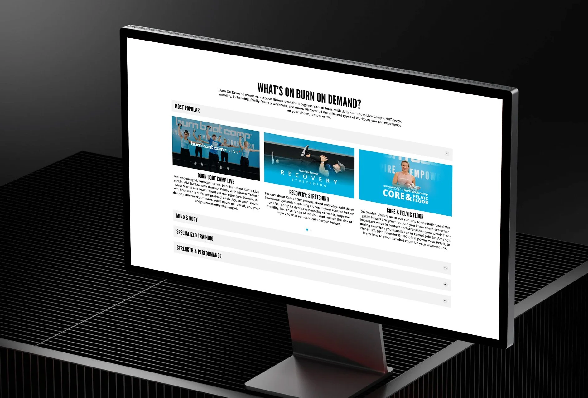
In addition, there were several areas of the page where there was simply too much information presented in a very unorganized way. For example, the “workouts” you could utilize were represented by an extensive carousel that was confusing to navigate. And from the heat map data, it was clear users felt overwhelmed by the presentation of too many choices and not enough context.


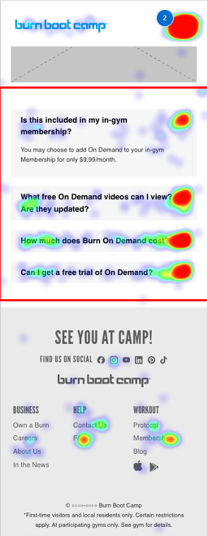
Heat Map Discovery
The heat maps revealed even more useful data as we planned the UX and content overhaul. The biggest discovery was the amount of activity at the bottom of the page with users spending most of their time on FAQs and then clicking around the site utilizing the footer menu.
This proved that users were not getting what they needed from the content at the top of the page and were clicking around the site to try and find more information.
The New Wireframes
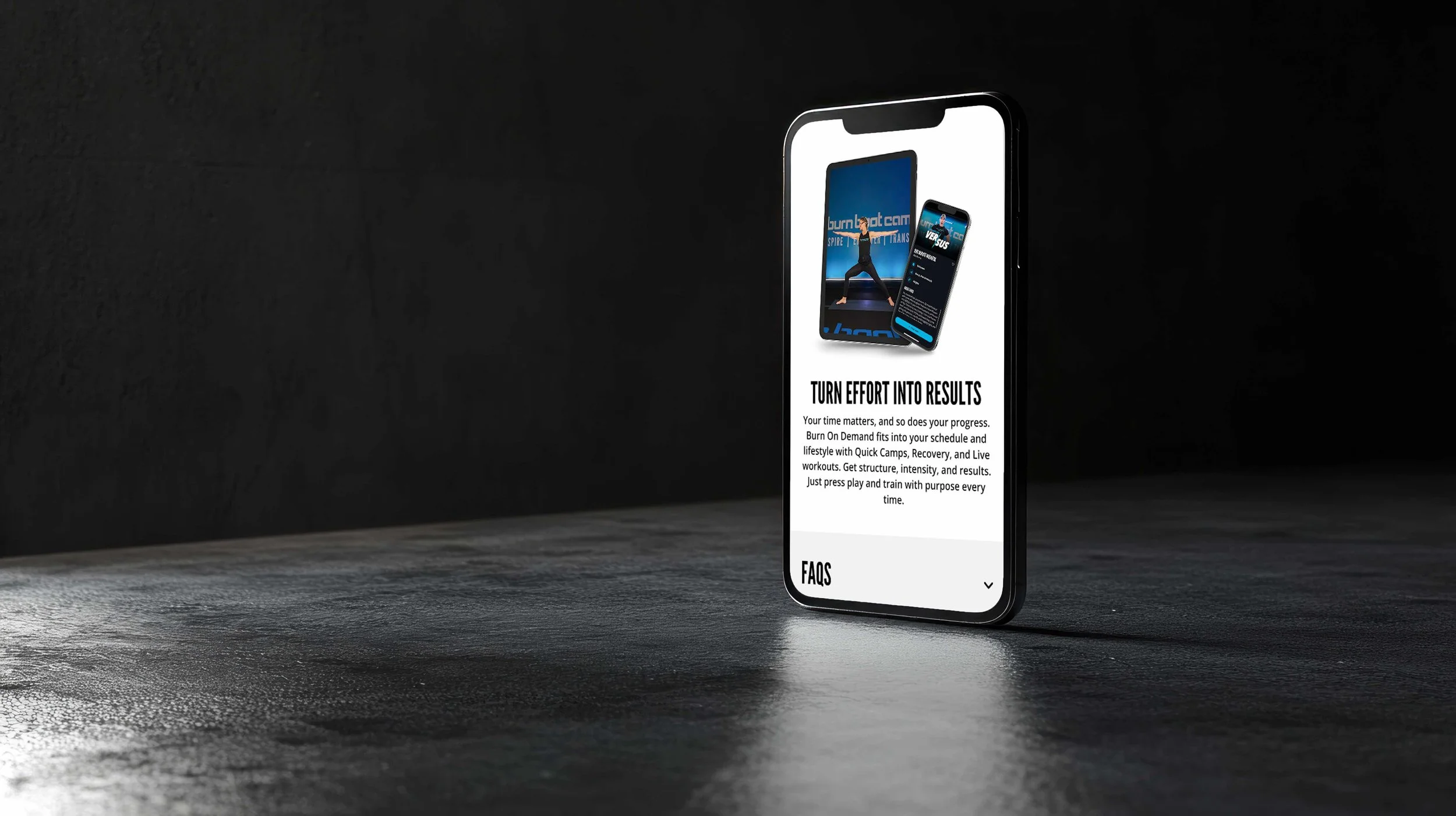
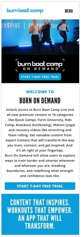
To fix the issue of users leaving the page in search of more information, we recommended a new header that clearly showed how the On Demand product was used. We also reorganized the page base don heat map data to have the most important questions answered with content near the top. This included adding the clearer content about the benefits of the product, a new explainer video, and a new way to organize the workouts with drawers for easier discoverability. In addition, we added to the FAQs so that users could get more answers without having to leave the page and explore the rest of the site.


Recommending An A B Test
After reviewing the wireframe with the client, we determined there was an opportunity to customize the content to go after two specific targets with two different use cases.
Version A would target big box gym-goers and speak to Burn On Demand as a tool they could use to enhance their workouts. Version B would target non-Burn members and get them to try Burn On Demand at home or on the go.
Due to timing, we updated the pages during the design phase to represent the two targets. Take a look below.
Version A


Version B